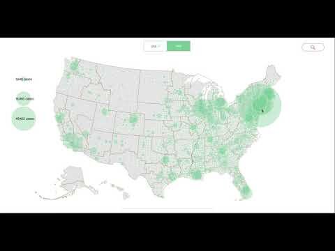
COVID-19 Map


Audience: Paid, Girl Scouts of America
Tools: HTML, CSS, JavaScript (D3.js), TopoJSON, Excel, Tableau, MapShaper
Process:
Ideation:
As we were entering uncharted territory with the Coronavirus pandemic, there was a need to visualize the impact of the pandemic on Girl Scout councils. Which councils were more affected by the pandemic than others? How can we overlay both county-level data and council-level data?
Data Structure:

This visualization utilizes six different data sources, three of which hold topographic information. I knew I needed a "confirmed count" of virus infections at a council level. The challenge presented here is that not all council fall on regular state lines. I created an array that mapped councils to their respective state.
The Italian Coronavirus data is from the Italian "CDC," while the American Coronavirus data is from the NYT GitHub.
Visual Design:
I wanted to play on the "Girl Scout Green" but utilize a less saturated tone of the green, which is the primary colour seen throughout. The council tooltip colour is also a Girl Scout branding colour. The type-face is Trefoil Sans, a proprietary type-face to Girl Scouts.
Coding:
I knew D3.js was my library of choice with the nature of the data structure and my overall custom end-design for the map. I used a square root scale to see the outbreak clusters more easily. I also wanted to see data at a county level within a council, so I added that. There's a reset button that allows you to pan out to the original view. I also utilized the autoComplete.js library for the search bar functionality to easily query the councils which allows users to jump to a council in question. I added an Italian map to view cases relative to Girl Scout troop locations in Italy. At the time of the build, Italy was at the epicenter of the pandemic. I also created a toggle to toggle between the US and Italy views. I included a legend on the left side of the screen that scales when the data is updated.
I made a couple of feature additions including a death count and a rank using confirmed cases per council, that provides context to where a certain council aligns vs 110 others on Coronavirus impact.
Result:
I knew that hosting would be a challenge. Due to the sensitive and proprietary nature of the data, I could not utilize github.io pages to host the code. I ended up hosting it on SharePoint, which worked well. This way, the map could be shared internally by both councils and GSUSA headquarters while not exposing the code and underlying data to the public.